Operning Titles To Three Films
In this blog post I will be analysing the opening to three films and impaticually looking at the order that the film titles and names of technical crew appear.
The Talented Mr Ripley Film
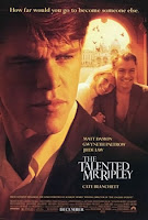
The Talented Mr Ripley
 The first opening titles I looked at was from 'The talented Mr Rippley' I noticed that the first title which appeared was the film company'
 Paramount' there company picture camera up on the screen usually its this order of status which takes place first. then the camera cuts to a panning upwards network buildings, with the production companies name fading into the screen with a pixel gathering theme. You can evidently tell that these companies were involved in the making of the film because the soundtrack and dialog from the film starts to play in the background. the next thing that happened is it cuts into a black screen and one at a time slices of individual parts of the screen start to fade and drop out of the frame to revel the image, they've started to revile the actors face first because the main characters face begins to appear at 0.42 second into the film. The camera work pans around the actor revealing a couple of the famous stars acting in this film whilst the foreground is still disappearing to reveal the actors surroundings. Once the camera stops panning at 0.54 then the Film title fades in and joins together, one thing that I like about this title is that the word 'talented' doesn't appear automatically, instead the editors have done it so that it flicks through a load of different words associated with the word talented, also the colours change to a variety of red, purples and yellows which creates an interesting effect. Also the font to the word talented is completely different to the rest of the title, it has a red stamp effect and no capitals where as the rest of the title have tall white capital font, this is eye-catching because the white complements the red colour. After the title appears so does the next scene to the film, 2:18 in and we've already seen dialog between some of the characters and more of the celebrity names are shown on screen a yellow /orange transparent box drops down and black text overlays bait of the characters heads. the reason that the director has chose to film a few minutes before they show the rest of the characters is perhaps because the audience have just see them science the first showing of the stars.
One thing that editors sometimes do is list the stars names in alphabetical order, this is so the actors don't get offended or feel less important if they have been put t the bottom, usually put in alphabetical groups of different things such as actors, production and camera crew to make the order less biased or feel like the director has a favourite. However this is usually done at the very end of the film but can also be done at the opening titles.
Compared to how film text is laid out in this generation its a lot more structure, where as in this film 'The Talented Mr Ripley' the text is very random , as if they've chose a quirky foxy style of off Dafont and used it as there opening titles name. Where as in comparison with the film 'Begin Again' which is a roughly newish film for 2015 the text colours and font repeat and stay the same type of theme throughput the opening title and credits. Therefore this is something I take not consideration when choosing the type if text i will be editing into my final opening thriller.
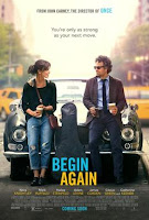
Begin Again

 The second opening title I analysed was from 'begin again' to start with I was shown 'exclusive media' and 'the western company' these are two film companies that helped in the making of this movie. The production company then emerged onto the screen showing that 'sycamore' was apart of the production company. However another film company did pop up a few seconds into the opening picture of the film, but it was the names repeated ,they were placed as an overlay with white text. When white text is used within an overlay of an image you have to make sure that it doesn't blend into the background, and another thing that you don't want to happen is
that your not meant to take away the audiences attention from whats happening on the screen. This is why vibrant colours are not used for overlaying text instead usually a basic black shade is preferably used. Every company wants there brand to be shown at the beginning of the film, however only the main producers and writers/ companies that were involved in the making are shown at the beginning of a movie, the rest like the camera crew, costume designer, make up and actors legally have to have there name and position in the making shown at the end of the video, this is something that legally has to be done, its to highlight who had import into the production and creating of the movie. Another thing that I noticed that appeared a few minutes into the film was that the 2 main stars that were used in this film, this could be because we where shown dialog between both of the actors therefore would explain why we are being shown there name. by adding well known actors names it draws in the actors fan base, for example it could be the purpose of people watching the film.
Borne Identity
No comments:
Post a Comment